Näytetään tekstit, joissa on tunniste infografiikka. Näytä kaikki tekstit

2013/04/21

graphics for astubutiikkiin.fi

Here we have some new images for the upcoming portal. The following illustrations and infographics are meant for marketing.

In the images on the left the principles are visualized from the company's / manufacturer's point of view, and in the images on the right side from the customer's / consumer's point of view.

Click for a closer look.


It's nice to see the positive changes now that people's attention has increased towards the concept of the portal. The astubutiikkiin.fi Facebook page is also leisurely getting more and more likes. That feels good.

For my international readers there's a lot to guess in these pictures - Finnish language is rather hard to understand. :D


I hope you like these as much as the customer does. All in all, I am really grateful to be a part of this. Thank you / kiitos, Mari.

The images have also been posted to the Astu Butiikkiin -blog:

2013/02/14

VD

© Amanda Halonen

Here's my Valentine's Day greeting, click to see closer. :)

My VD post from last year can be found here. There you can also download a greeting card if you like any of the colors, and then print it or send it via web. Love you all, *mwah.

2012/05/22

ennakkotehtävä - Super Edition


The word 'super' derives from two things today. Firstly I got an exam invitation letter from the last school I applied to, School of Arts, Design and Architecture! Happy happy! Secondly the word 'super' is for the amount of the following photos and the time spent on editing them. If you own a crappy camera, you have to retouch the images and nothing changes that fact, ever. At least that's how it goes for me, damn you perfectionism. Oh well.


This photo of me was originally taken for this CULT magazine, not for the layout of the Metropolia motivation letter. Feather earrings are somewhat my trademark. Now BAM, here's my fanzine:


I came across a little accident which almost caused me a trauma. I noticed at the printing place that the title font is incorrect throughout the whole magazine. In the upper pic you can see how it should've looked like.


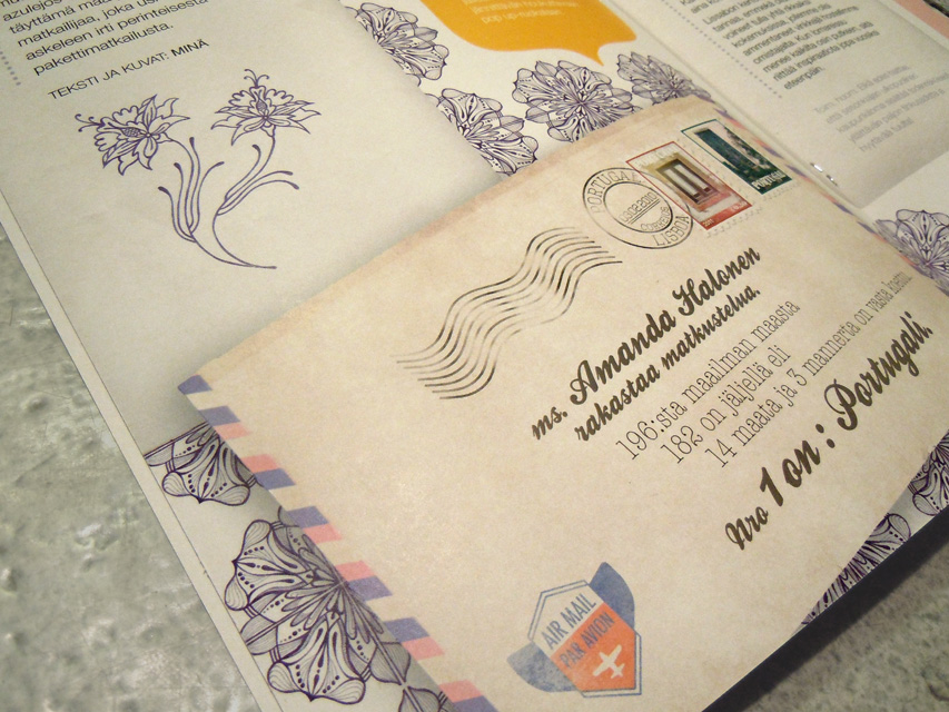
I also made a card with info graphics which was required in the assignment.


All this took many long hours. I'm happy that all the work paid off.


The horizontal pics can be viewed more closely with a click. Now let's hope I rock in the exams!! :) :)

2011/03/09

the basic

(c) Amanda Halonen

Sitten voidaan miettiä, miksi kahvi on eri lokerossa kuin rentoutuminen. Kahvi on mulle pyhää ja siksi se ansaitsee ihan oman sarakkeensa. Lisäksi kahvittelun aikana on usein paahtava ideointi käynnissä. :)

2011/03/04

AY 1234

(c) Amanda Halonen